
Amplified Identity
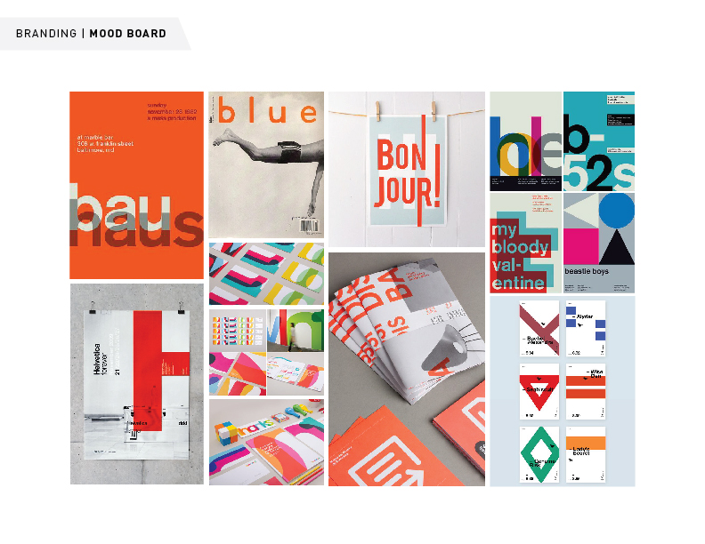
As lead visual designer at Amplified, I had the opportunity to create the visual direction and brand for our new design agency. Beginning with a brand story, the founders guided me through the vision for the company. It was crucial to showcase our unique approach – how we strive for diversity, collaboration, and curiosity when envisioning a user experience. We needed a brand that was both strong and identified us as a team.
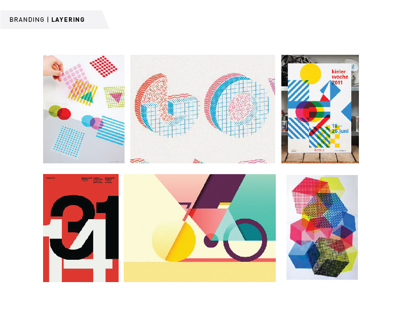
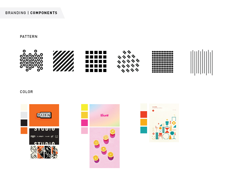
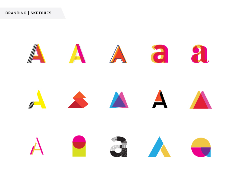
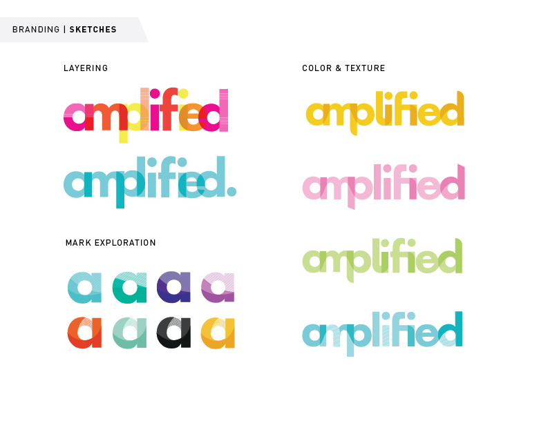
The final logo uses pattern, color, and layers to form the word mark. Letters are joined together to create a fluid piece, but within the whole, individual layers and textures combine to make the form stronger.
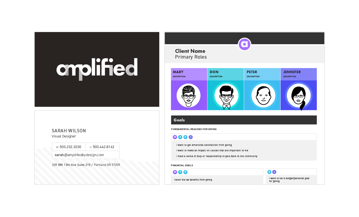
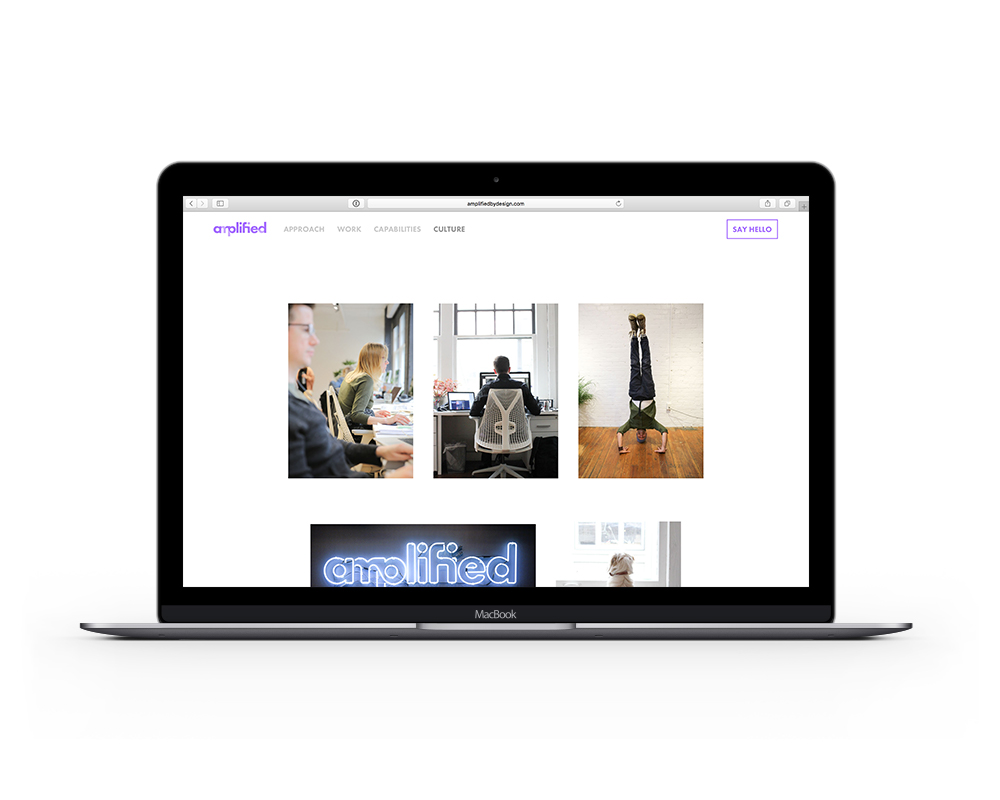
The brand identity included multiple lockups and versions of the logo, our agency website, business cards, as well as digital templates to be used by admin, designers, and developers on the team. In addition to digital assets, we designed a 5ft neon sign for our office, to bring our brand into our physical space.
Logo Process